Hopeful Printing
I am always so grateful for thoughtful, collaborative clients, and Sarah Lutman from Lutman & Associates is always bringing me fun and inspiring projects.
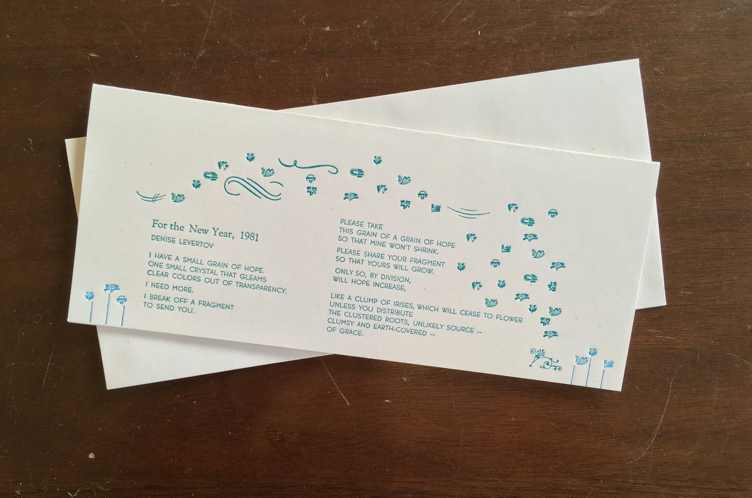
This was the third year in a row that we have collaborated on a design for her New Year's cards. Sarah picks out a poem that speaks to the spirit of the year to come, and I set it in type. This year, she selected the pitch-perfect "For the New Year, 1981" by Denise Levertov:
I have a small grain of hope—
one small crystal that gleams
clear colors out of transparency.
I need more.
I break off a fragment
to send you.
Please take
this grain of a grain of hope
so that mine won’t shrink.
Please share your fragment
so that yours will grow.
Only so, by division,
will hope increase,
like a clump of irises, which will cease to flower
unless you distribute
the clustered roots, unlikely source—
clumsy and earth-covered—
of grace.
We all need a little bit of hope in the start of 2017.
When I first read the poem, I was immediately struck with an image of dandelion seeds - one small whole, being distributed on the breeze, to grow and multiply. But interpreting that literally felt a little cliche. Instead, I thought immediately of these metal type ornaments I had been waiting for an excuse to use - designed by W.A. Dwiggins and cast by Skyline Type Foundry.
But how to make them appear lithe and airy, as if blowing on a breeze, while showing the power of hope to multiply? It took a fair amount of trial and error typesetting, but I feel pretty good about how they turned out.
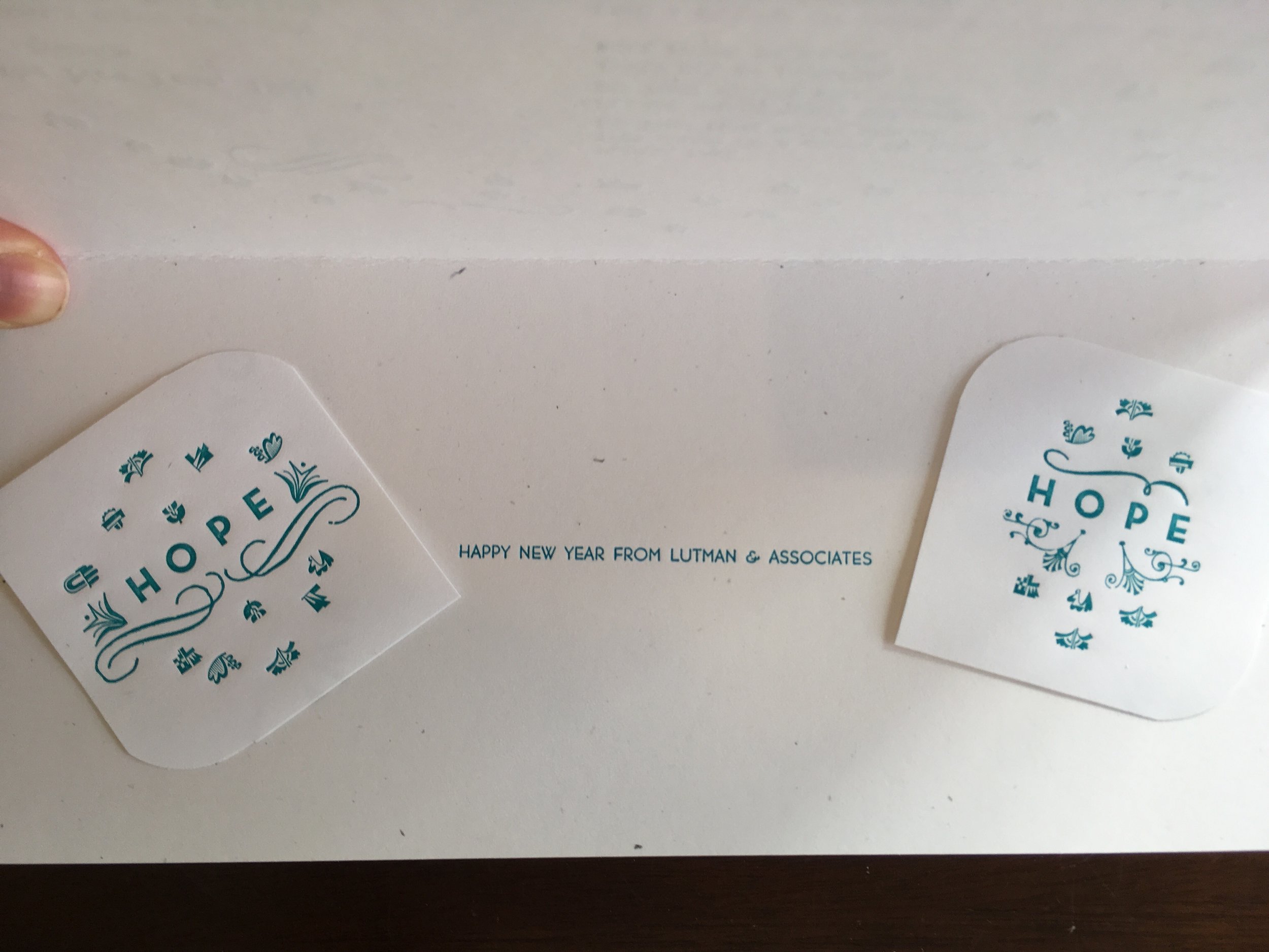
We also decided to include some tangible pieces of "hope" to spread around, in the form of custom type-set stickers. This was a great project, and I keep a copy of the poem on my windowsill, where I can consult it on dark days.


