
One Man's Obsessive Quest for Beautiful Color
John Franklin Earhart was a printer in Cincinnati in the late 19th century, and was one of the founders of what has become known as the Artistic Printing movement. Lots has been written about this incredible trade skill and design aesthetic, including a recent beautiful book that should be in the collection of anyone interested in traditional letterpress.
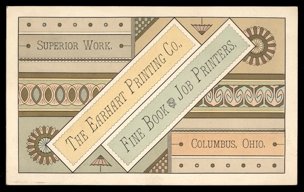
An example of artistic printing from John Earhart's printing company
Essentially, in the 1870's and 1880's, as technological advances in printing such as color lithography created increased competition for letterpress printers, some in the trade advocated a wild break from traditional typographical style and design. For centuries, type setting and printing had followed basically the same visual rules, mostly imposed by the process of letterpress itself. Straight lines of type, maybe a border or ornament or two, usually in one color. Artistic printing sought to "bend the rules" by printing on angles and delicate curves, creating layered, multicolored visual feasts, all with metal type, ornaments and brass rule.
Earhart was meticulous and thoughtful when it came to color. In 1892, he published a groundbreaking work called The Color Printer: A Treatise on the Use of Colors in Typographic Printing. This lush, beautiful book was as practical as it was magnificently designed and printed. The preface states:
" It has been the aim of the author to produce a work showing, in a measure, what can be accomplished with common colors, by mixture, by printing over one another, by printing over bronzes, and by harmonious combinations."
And so it does. It's a recipe book of sorts, with color samples that give specific instructions on how to reproduce each shade and hue. I had the opportunity to look through a copy of The Color Printer in the Special Collections of the Hennepin County Library, which you enter through a gorgeous, ornately carved wooden archway. Unfortunately, it still has fluorescent lights, which means these images I was able to snap don't do the book justice.

Fortunately, the whole thing is available for free online through my favorite resource, archive.org.
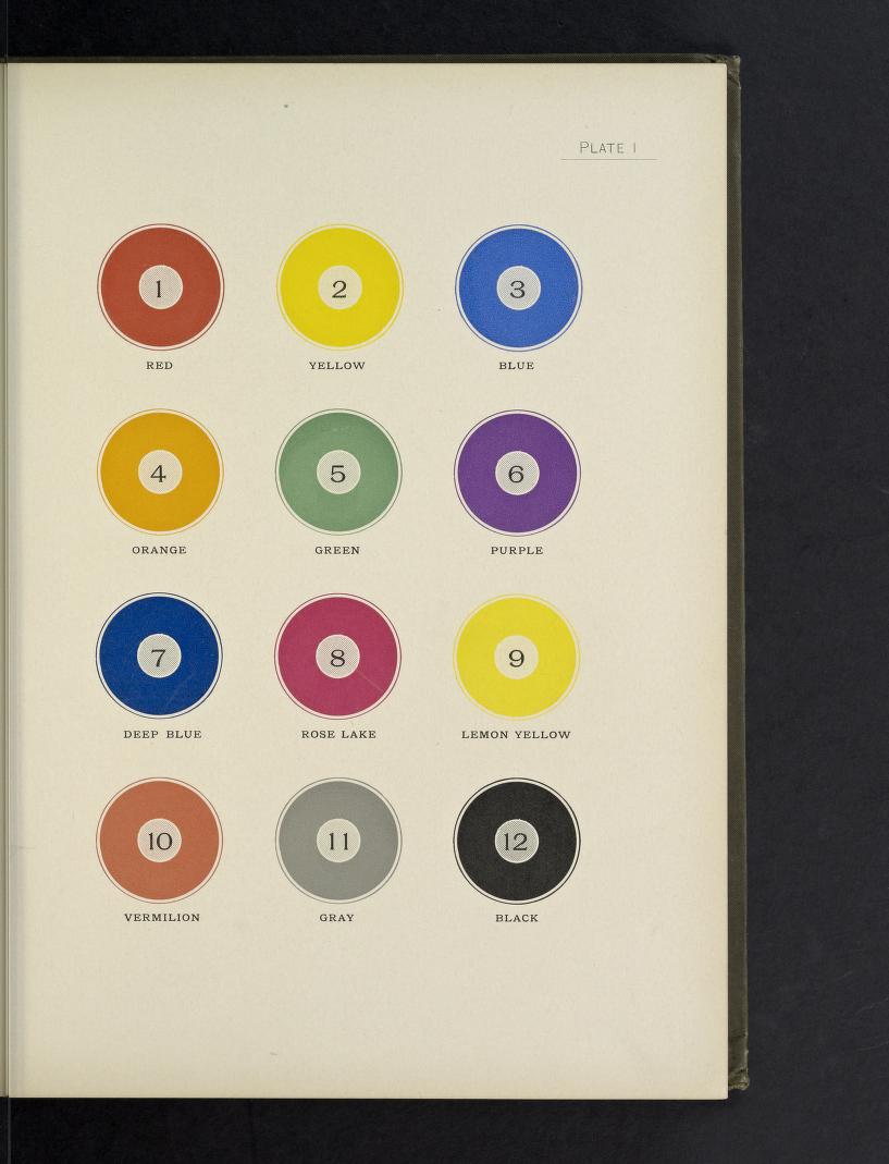
Plate 1 shows the 12 core colors, upon which all the other hundreds of color samples in the book are based.
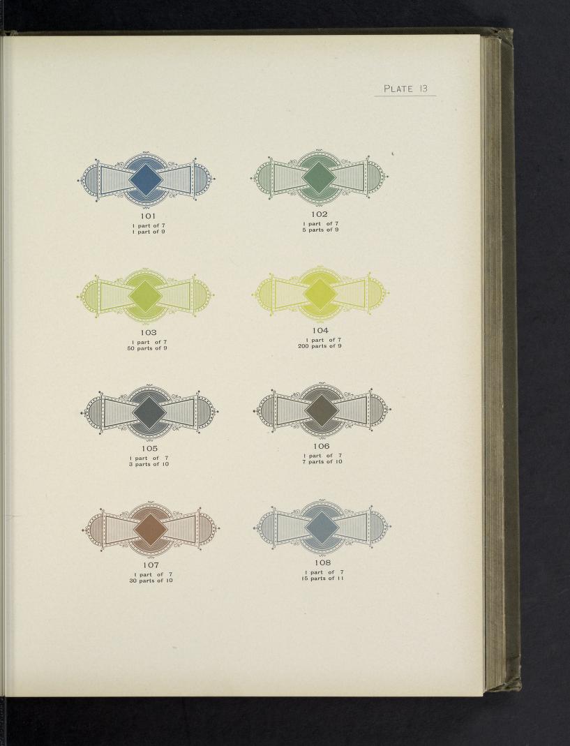
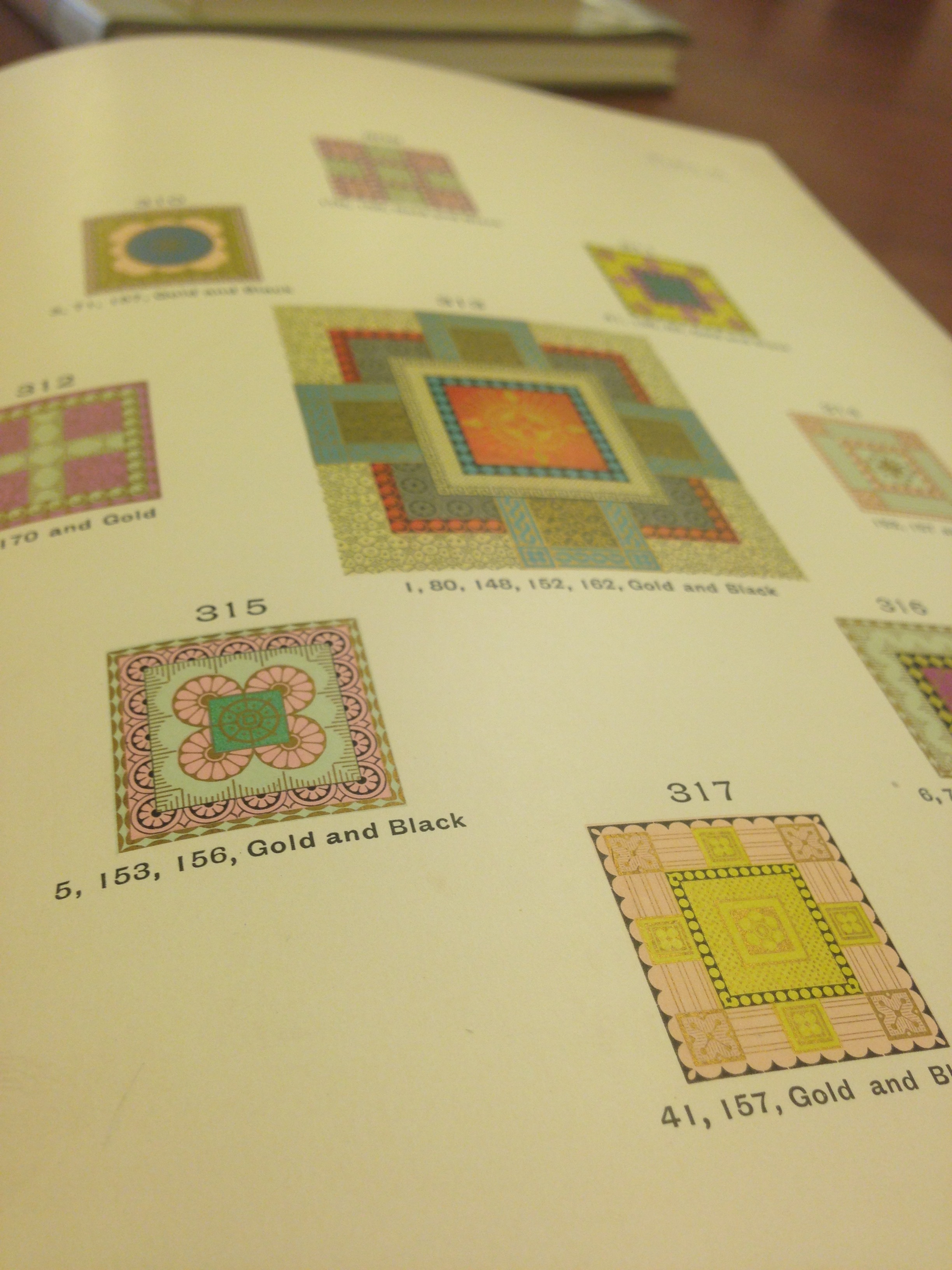
Examples of the color "recipes".

Examples of the overprints of various colors, in different patterns and halftones.
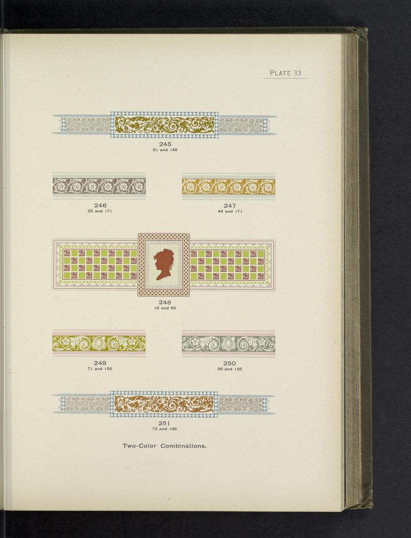
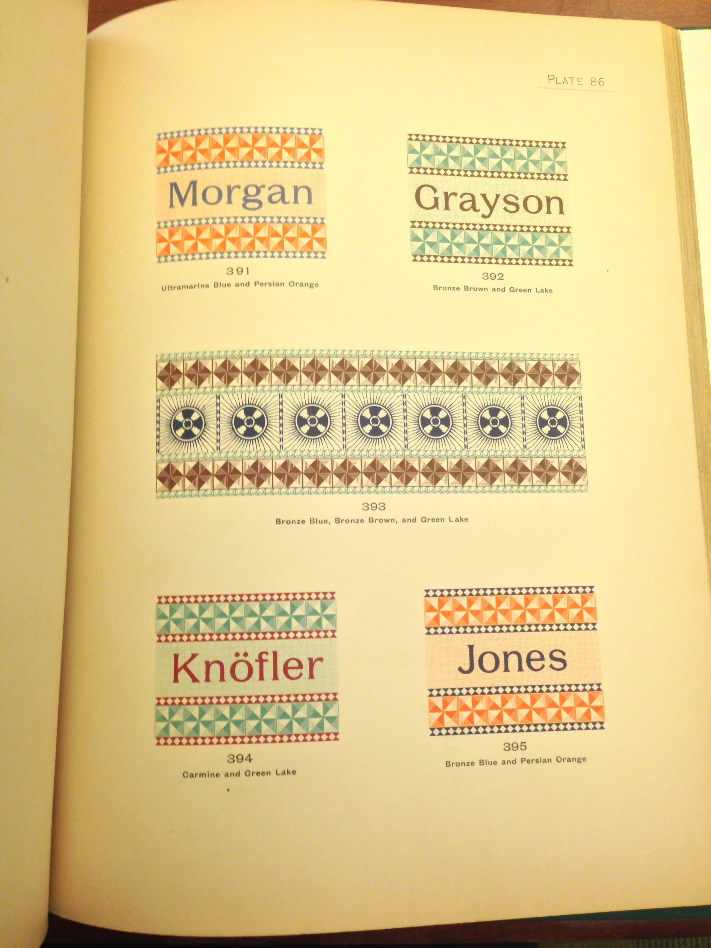
A showing of two-color combinations that work well in harmony with each other.

Specimens of metallic inks and color combinations on dark paper stocks.
It's well worth spending some time perusing at length. Color is one of the most challenging aspects of traditional letterpress printing - inks are mixed by hand and are affected by the color of the paper, the tone of the material being printed, and many other factors. The Color Printer, though over 120 years old, is still an amazing resource and research tool.