Tales of a Letterpress Printer: Designing Wedding Invitations with Metal Type
I've been a letterpress printer in one form or another for over 7 years now. In many ways, I still feel like a newbie – but there are a few things I've learned along the way. One of the hardest lessons has been to never accept "good enough".
I'm far from a perfectionist in my letterpress work. If you look at my style, you'll see that I love the textures and colors that come from accidental overprints, stray marks, the dents and dings of vintage type and, above all, honoring the process of letterpress printing, and not just the product. I want you to be able to see how it was hand-crafted.
In my early days of printing, I loved the process but I was afraid of taking risks and spending a lot of time in a design. I just wanted to get a job done quickly, to see the results and feel the paper running through the press. But I was often dissatisfied with my work, thinking that it lacked structure, harmony and generally looked immature. Probably because it was!
Now, I know that I'm going to go through many, many iterations of a design before I'm happy with it. This can be maddening and time-consuming but also very exciting. A major leap forward in my process came when I began using carbon copy paper to make inkless, quick impressions of my metal type forms to be able to better "see" my design before printing.
When you design with type, instead of a computer, you have to think backwards, and sometimes upside-down. Each color is separated and printed individually. You have to work within spatial constraints (you might not have the font you want in the right size, for example, or a piece of decorative type might create too much white space) and the limitations of the type you have in your shop. It's like building a lego structure while looking in the mirror, without the box to guide you.
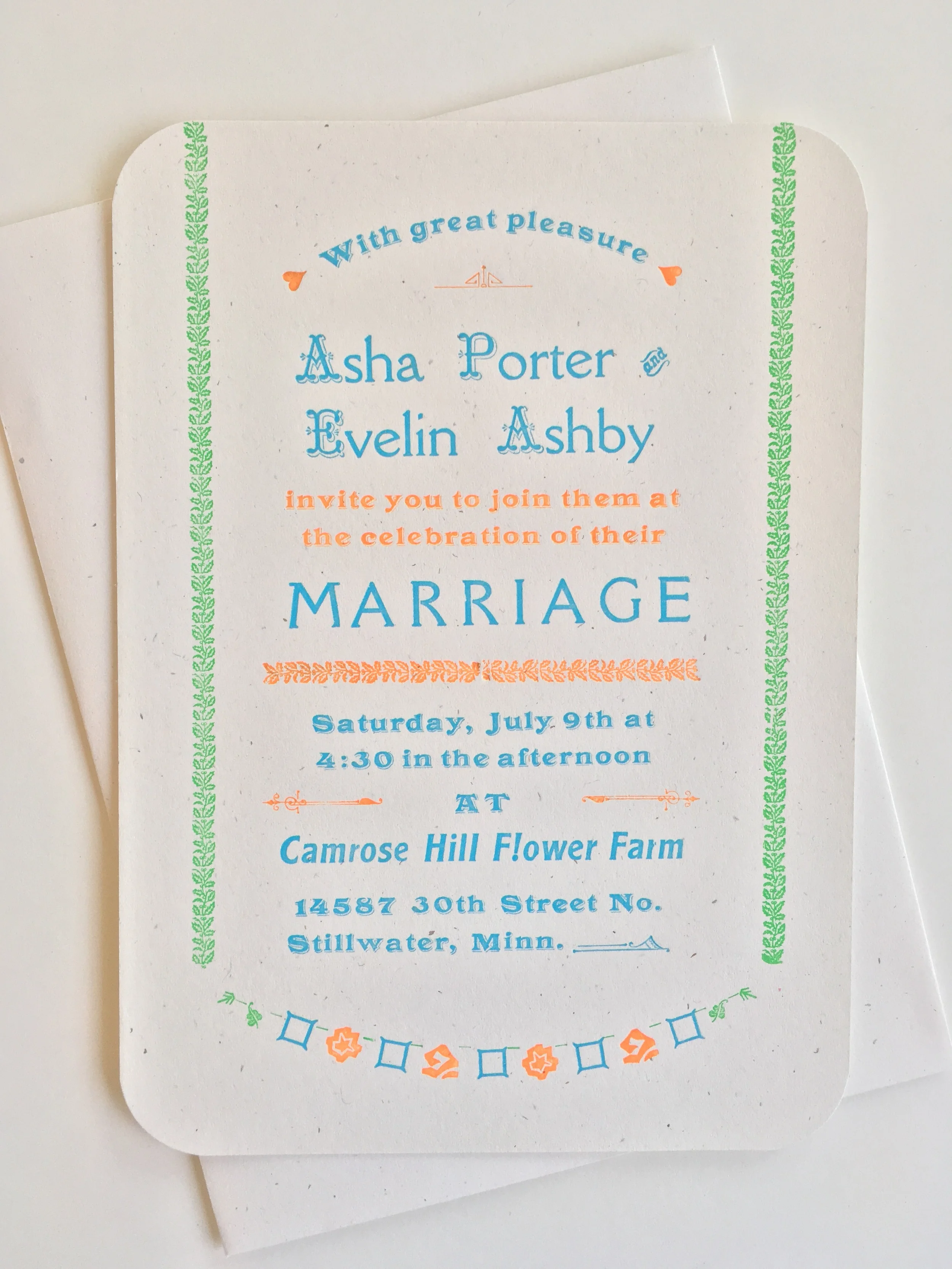
When starting the custom design process for wedding invitations, business stationery, or any other letterpress project, I start by getting a clear sense of design direction from the customer. From there, I start pulling out typefaces, border, and other elements that I think will work. Then I start pulling carbon paper proofs, and immediately start shaping and evolving the design. Elements get moved, removed altogether, and re-thought.
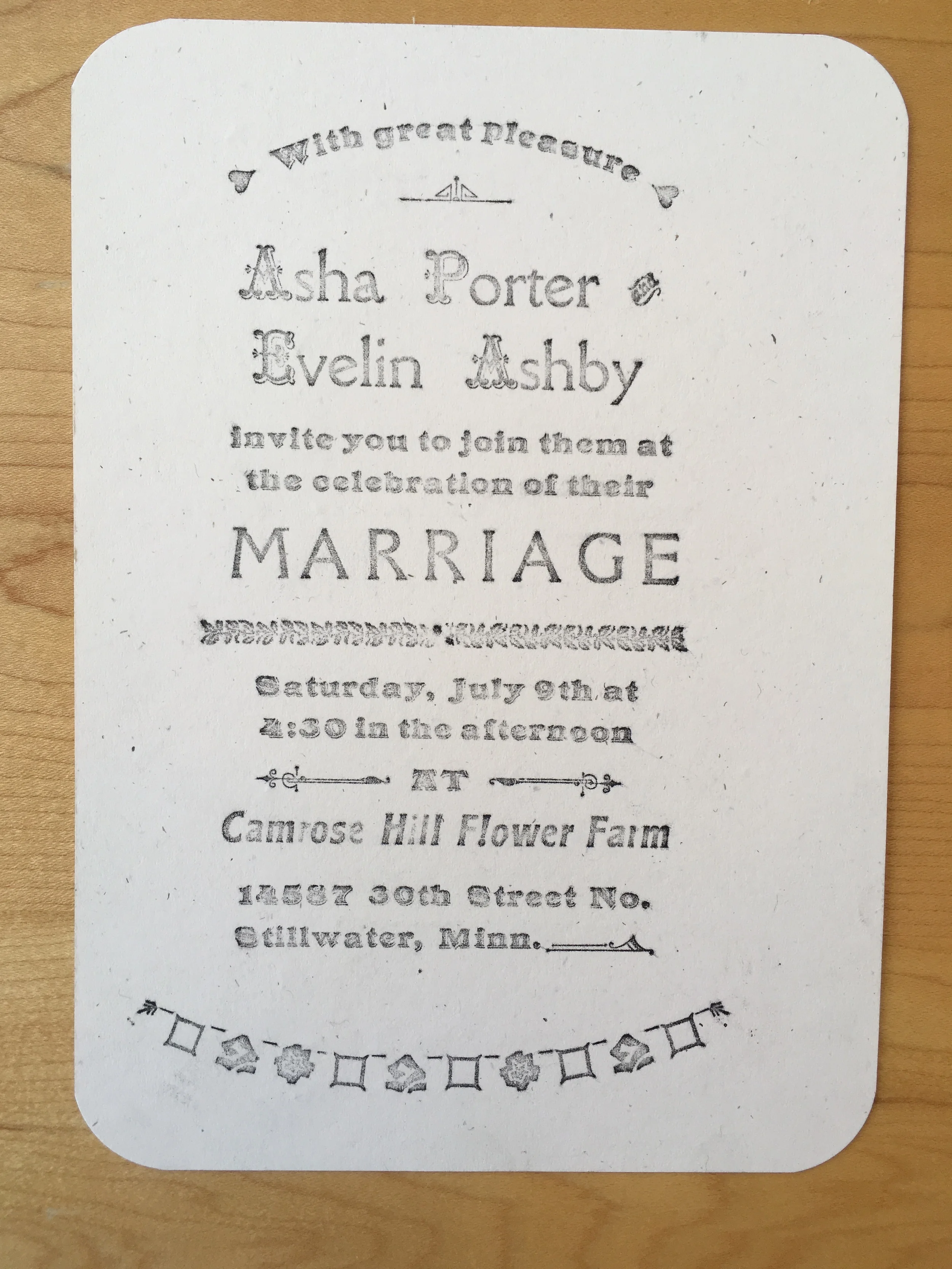
Getting closer!
The final design will have a balance of typefaces, decorative ornaments, color and texture. It may have taken a few more hours to get right, and it certainly won't be perfect, but how boring would that be?